UX/UI · WEB DESIGN · PRODUCT TEMPLATE · 2025

One clear way in to 23 cryogenic machines

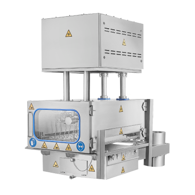
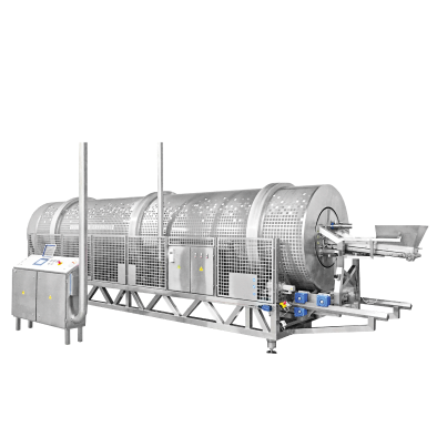
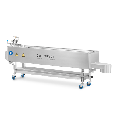
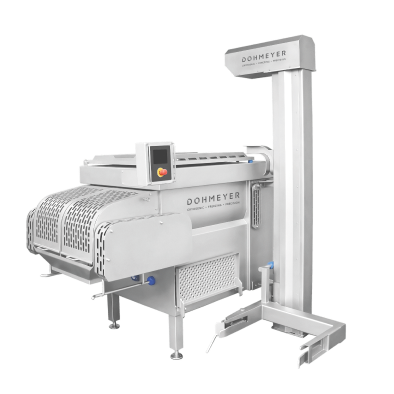
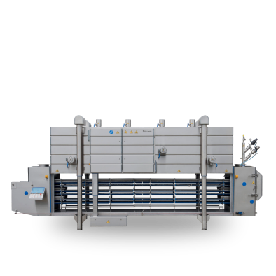
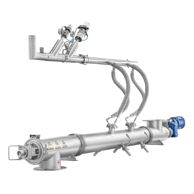
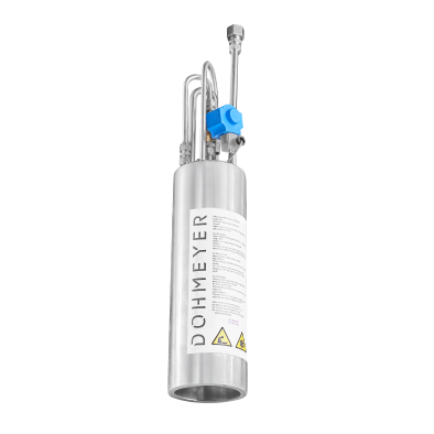
A new website and brand elements for Dohmeyer, a maker of cryogenic freezing equipment with roots in Ghent and production in Mielec — built around four industries and the know-how behind every machine.
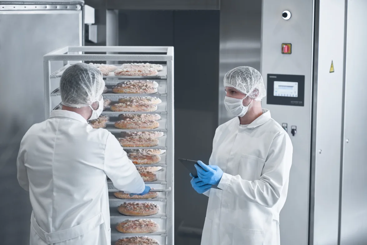
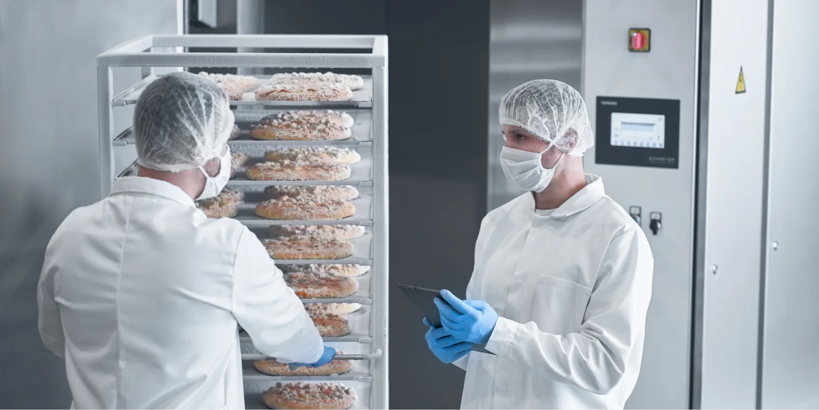
Dohmeyer engineers inspecting food in an industrial cryogenic freezer
ROLE

UX/UI and web design

CLIENT

Dohmeyer

METHODS

Brand DNA workshop, value matrix, archetypes, wireframes, feedback rounds

MY PART

Website structure and design, product page template

TEAM

Husarska Design Studio — with Jadwiga Husarska-Sobina, Andrzej Sobina, Adriana Cież and Sebastian Zbozień

01 WHY A NEW WEBSITE

A strong engineering company with a website that undersold it

Dohmeyer’s freezers run around the clock in food and pharma plants, but the old WordPress site did not show it — in the client’s own words it was “not interesting”, “not updated” and “old-fashioned”. With 23 machines and four industries, buyers could not find their way to the right equipment.
BRAND DNA WORKSHOP · 2023

The Sage

The archetype that came out of the workshop with management: the company people learn from, not the one that competes on price.

WHAT IT MEANT FOR THE WEBSITE

Know-how is the product

Technology, applications and FAQ become real pages, not an afterthought.

Show results, not specs

Machines are presented through the product a customer makes and the result they get.

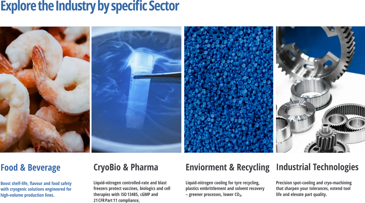
Four industries, four questions

Food, pharma, recycling and industrial buyers each need their own way in.

24/7 service, visible

The strongest promise had to be on every page.

02 ANALYSIS AND CHALLENGES

23 machines, four industries, three ways to search

Before the layout we mapped who comes to the site and what they look for. The hardest part was not the look — it was letting very different buyers reach the right machine in a few clicks.
01

Three ways to search

Some buyers start from their industry, some from a machine they already know, some from a question. The structure had to support all three.

02

Filters that remove

A chosen sector, product and application leave only matching machines. The client wanted the others greyed out — the filter cannot do that, so we show recommended equipment and keep an “All equipment” page.

03

Uneven content

Some machines had full leaflets, others only a name and a photo. One product template had to work for both.

04

Global, and easy to update

English and Polish, offices in Belgium, the USA, Poland and the Middle East — and content the marketing team can update in Webflow.

HOW THE INDUSTRY FILTER WORKS

1

Sector

Food & Beverage · CryoBio & Pharma · Environment & Recycling · Industrial Technologies

2

Product

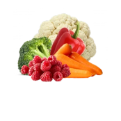
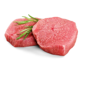
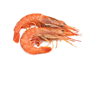
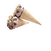
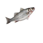
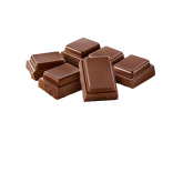
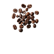
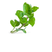
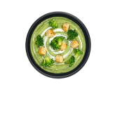
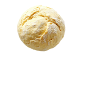
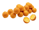
Shrimps, ice cream, ready meals, meat — as photos a technologist recognises

3

Application

Freezing, crust freezing, coating, hardening

4

Equipment

Recommended machines, plus a link to the full range

Until a sector is chosen, the home page shows the full equipment grid — so nobody has to filter just to see what Dohmeyer makes.

03 INFORMATION ARCHITECTURE
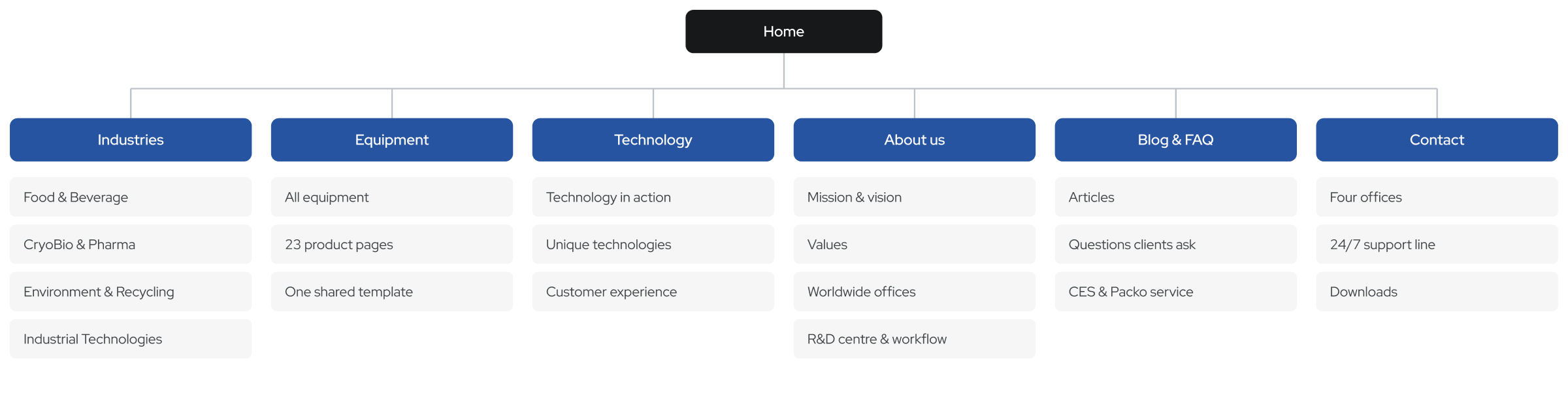
Every route leads to the right machine.

The structure follows how clients search: by industry, by machine or by question. Each path ends on a product page with a clear next step — contact, download or support.
Dohmeyer website information architecture

Industry selector

The same four sectors open the site and filter the equipment.

Language and search

English and Polish, with a search in the menu.

Footer with all offices

Belgium, USA, Poland, the Middle East and the 24/7 line.

04 FEEDBACK AND ITERATIONS

The client’s notes, and what we did with them.

CLIENT NOTE01

“Show all products before the search.”

WHAT CHANGED

The home shows the full equipment grid until a sector is chosen, plus an “All equipment” page.

CLIENT NOTE02

“Grey out machines that don’t fit.”

WHAT CHANGED

Not possible with the filter — non-matching items leave the list — so recommended equipment is shown instead.

CLIENT NOTE03

“Pictures instead of icons for markets.”

WHAT CHANGED

Industries and products use real photos; pictograms stay for machine features.

CLIENT NOTE04

“Other languages, with a globe.”

WHAT CHANGED

English and Polish switch in the header.

CLIENT NOTE05

“CEO, mission and vision on the site.”

WHAT CHANGED

About us opens with the managing director, mission, vision and values.

CLIENT NOTE06

“Stress 24/7 support.”

WHAT CHANGED

A 24/7 technical line in the footer and on the contact page.

CLIENT NOTE07

“Add a search.”

WHAT CHANGED

A search sits in the menu, next to the language switch.

CLIENT NOTE08

“Better footer and legal notes.”

WHAT CHANGED

The footer lists every office and the 24/7 line; company data moved under Legal notice.

05 THE LIVE SITE IN MOTION

Selected interactions

The product template in use and a quick tour through the main pages on mobile.

06 FINAL DESIGN

Four industries, one clear way into the product range.

EXAMPLE SCREEN · HOME

Open live website

07 STATUS
Live since May 2025.

The new site went live on dohmeyer.com in May 2025, built in Webflow by the studio, in English and Polish. Content and SEO work continued after launch together with Dohmeyer’s marketing team.
PLATFORM

Webflow

LANGUAGES

EN · PL

PRODUCT PAGES

23 machines

STATUS

Live on dohmeyer.com

MY PART
  • UX: structure, wireframes, user flows
  • UI design — desktop and mobile
  • Industry selector and product filters
  • Product page template
  • Pictograms and industry icons
  • Product leaflets
  • Content coordination with the client
HANDED OVER
  • Figma design for desktop and mobile
  • Template for 23 product pages
  • Pictogram and icon set
  • Leaflet layouts
  • Webflow site the team can edit
Visit dohmeyer.com ↗