Natural and formaldehyde-free
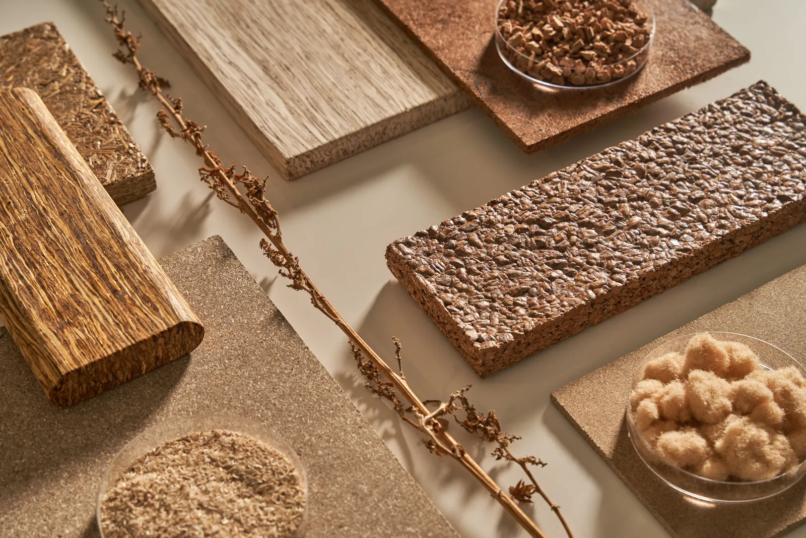
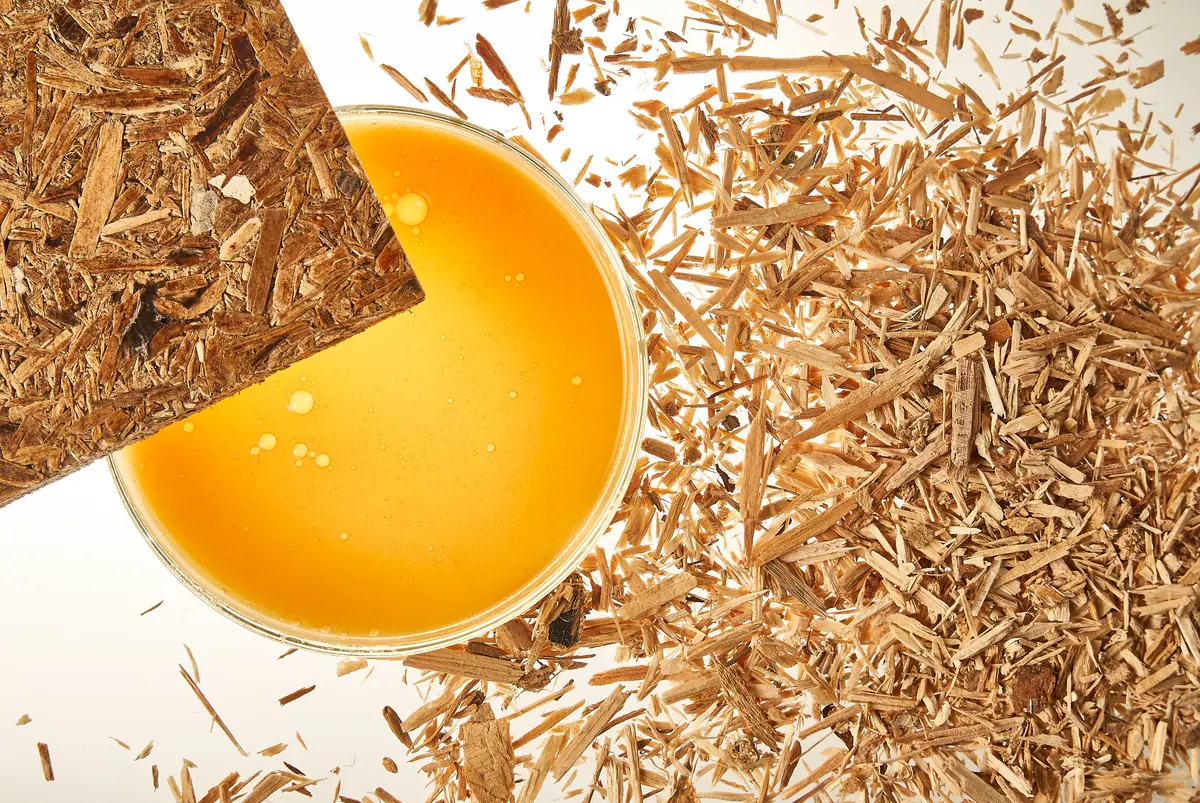
Many adhesives are one or the other. Being both is what sets Sestec apart — and it can be said plainly, with data.
CASE STUDY 2024
Sestec develops formaldehyde-free, protein-based adhesives for wood panels. The technology was ready; the brand and website were not. I refreshed the identity, designed the communication materials and website, and supervised the Webflow build.
01 THE PROBLEM
Regulation was increasing interest in formaldehyde-free adhesives, and Sestec already had a working technology. What it lacked was a clear identity, a website that explained the offer and practical materials the team could use in sales conversations.
Its adhesives end up inside furniture boards sold under its partners' names, so the company lives on trust and service rather than on a product shelf. The old identity did not show a company leading the move away from formaldehyde.
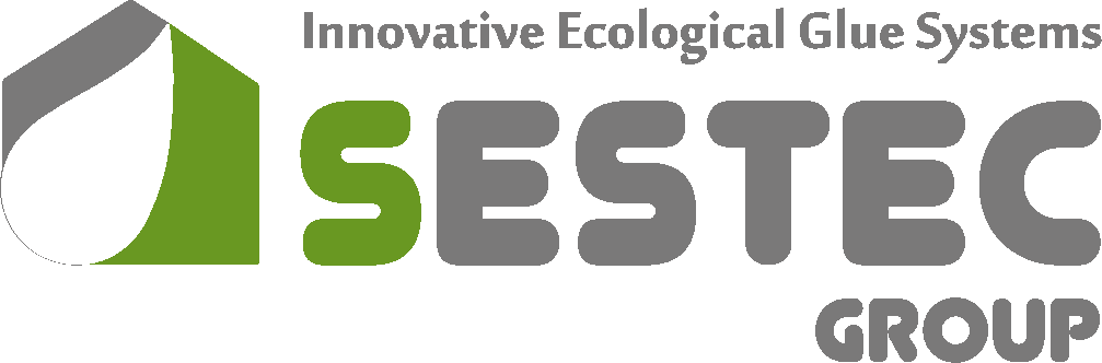
A house with a glue drop. The old logo had recognition worth keeping — and several companies share the name Sestec, so clients had to keep recognising this one.
Three names, no system. Different notes on every business card and nothing ready for fairs, print or the web.
Many thin pages. Different content in each language and no single place for proof.
Not a shop. Every client gets a custom solution, so the site had to explain the technology, not sell from a catalogue.
02 WHAT THE WORKSHOPS SHOWED
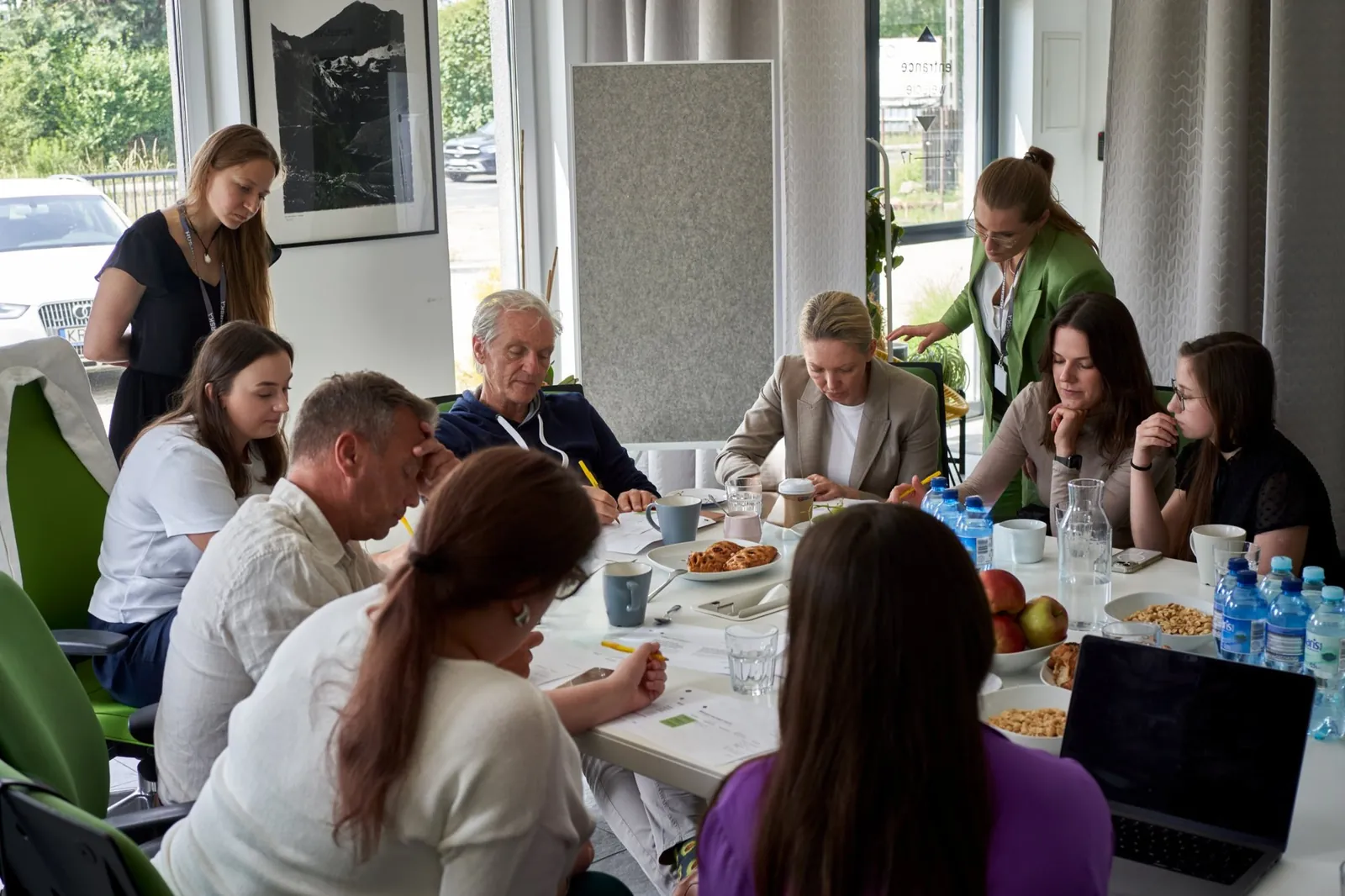
FROM THE BRAND DNA WORKSHOP
Many adhesives are one or the other. Being both is what sets Sestec apart — and it can be said plainly, with data.
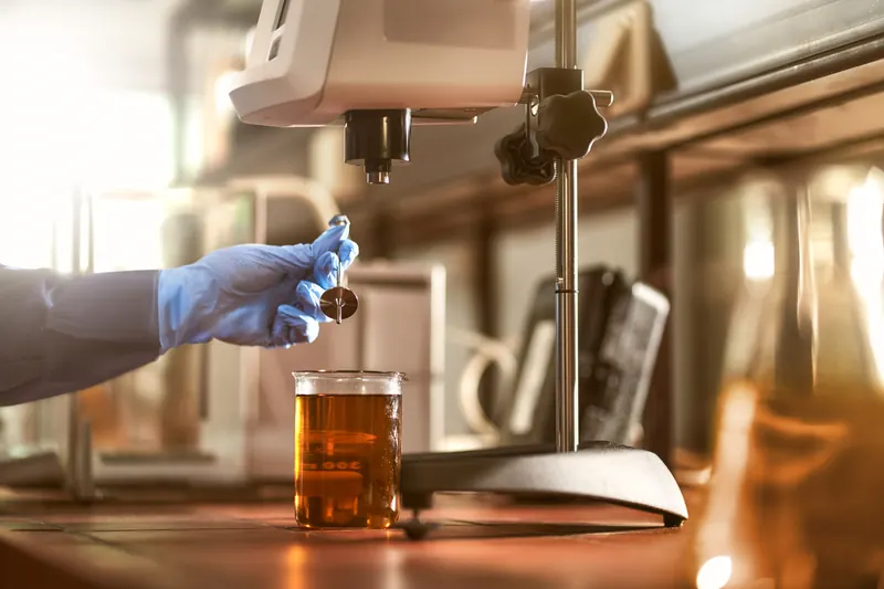
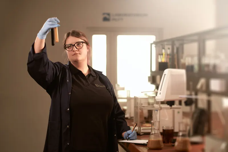
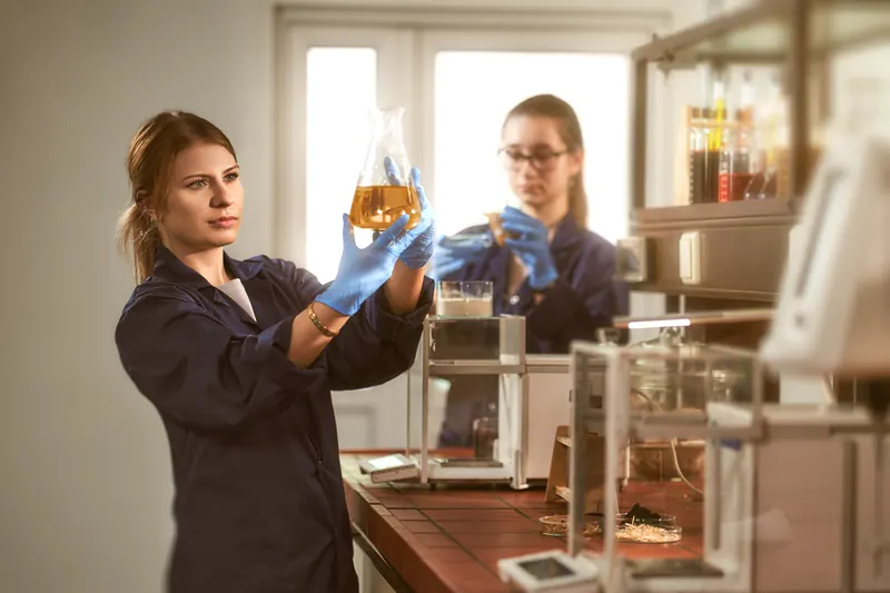
No cold, “medical” lab look. Wood, the process and real people, with the women who run much of the company in front.
Long-term partners want predictability; startups and R&D teams come for innovation.
Global in its partnerships, European in its roots, with a mostly Polish team.
Methods: personality sliders, archetypes, a values matrix, SWOT
03 THE IDEA
A new path for clients cutting their carbon footprint.
Safe products that meet ecological standards.
Quality, support and deliveries clients can rely on.
THE BRAND PERSONALITY
Explorer reflects the company’s interest in new materials and new applications. Sage adds the research, evidence and technical confidence that clients expect.
04 BRAND SYSTEM
06 INFORMATION ARCHITECTURE
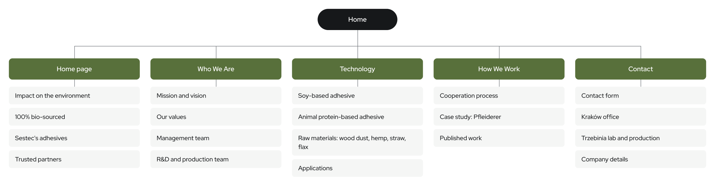
07 THE WEBSITE
THE STARTING POINT
The old site had many thin subpages, different content in each language and no single place for proof.
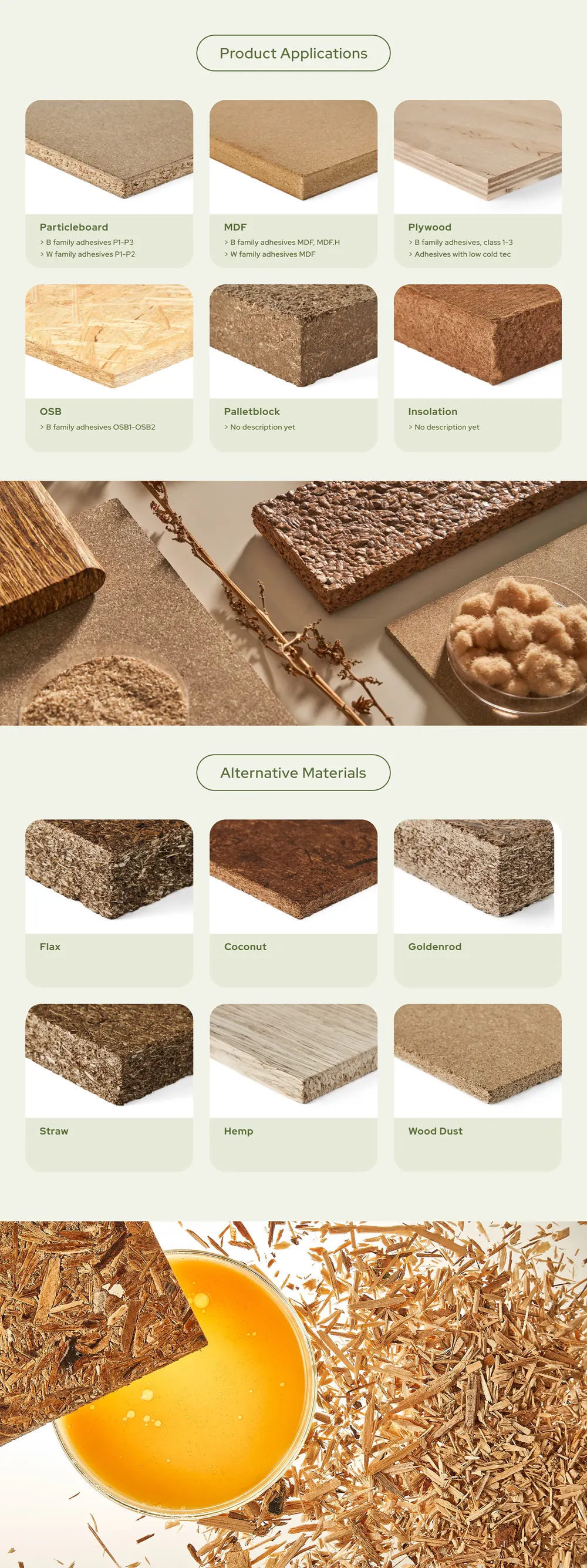
Two technologies, clear uses. Soy-based and animal protein-based adhesives each get their own page, with their raw materials and applications.
Proof in one place. A Pfleiderer case study, published work, patents, certificates and partners such as Globmix, IHD and Poznań University.
Built so the client can run it. A Webflow build, planned for English, Polish and German, that the team can update without a developer.
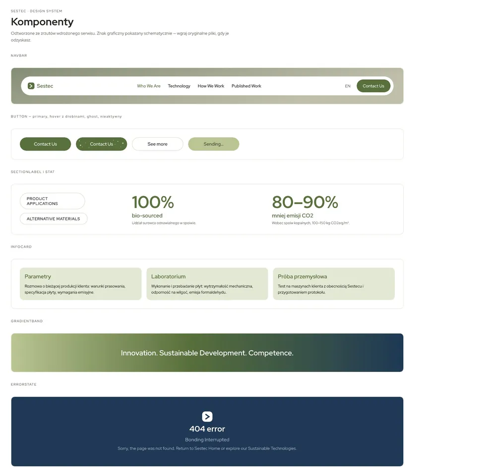
08 DESIGN SYSTEM
COLOUR
Forest Green #58703B
White #FFFFFF
Muted Green #BAC593
Sapphire Blue #1E3855
Light Blue #758FA5
Gradient #BAC593–#1E3855
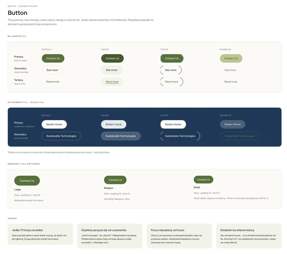
TYPOGRAPHY
Regular and Semibold for everything — technical, open and easy to read in English, Polish and German.
09 INTERACTIONS
10 FINAL DESIGN
EXAMPLE SCREEN · HOME
Open live Webflow prototype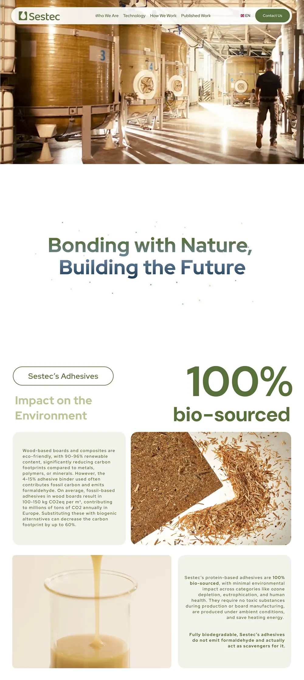
11 STATUS
MY PART
— Brand refresh — logo, colours, type
— Print — letterheads, cards, signage
— Client workshops and brand DNA
— Sitemap, wireframes, clickable prototype
— UI design — desktop and mobile
— Webflow build and launch
HANDED OVER
— Brand guidelines and logo files
— Print templates
— Photo shoot brief
— Figma files — desktop and mobile
— Webflow site the team can edit
— Structure ready for EN, PL and DE